


If you've worked with data before, you'd know that data is easier to understand when it's visual.
For example, with flow diagrams, you can show how information or resources move from different stages of your industry's typical processes. Among these flow diagrams, the Sankey diagram stands out because it shows changes in flow size.
Knowing the Sankey diagram is one thing, though. The problem is that building one manually can be challenging and time-consuming. So, you'll need a dedicated tool to make it like Wondershare EdrawMax. In this article, you'll learn how to create a Sankey diagram with the help of this tool.
In this article
What Is a Sankey Diagram and Why Use One?
A Sankey diagram is not used much in regular human life. However, in highly technical fields, you'll see them. Thus, if you're working in any of these fields, you've probably encountered a Sankey diagram before without even realizing it. These flow-based charts are often used in presentations because they allow the presenter to show how specific resources move across the different stages.
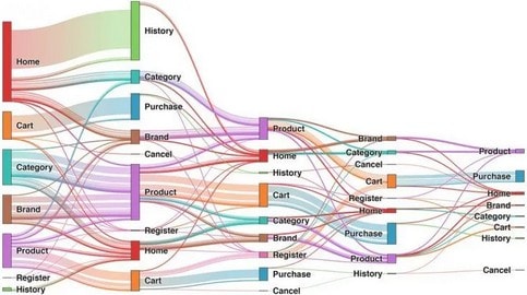
The width of each flow (otherwise known as the "link") is proportional to the amount it represents. They also connect to nodes that represent stages of the process. This is, more or less, the essence of what makes up a Sankey diagram.
Uses of Sankey Diagrams
Sankey diagrams often track energy usage, budgets, website traffic, or customer journeys. For example, you might see one showing how total revenue splits into different departments, or how website visitors drop off at each step of a signup funnel. Because the data is visualized as flows, it's much easier to understand than rows of numbers in a spreadsheet.
Benefits of Sankey Diagrams
The main benefit of a Sankey diagram is clarity. You can immediately spot where resources are concentrated, where losses occur, or which outcomes dominate. They also make comparisons easier because the width of each link tells the story quickly. Makes Sankey diagrams one of the most effective tools for explaining how data moves through a system.
How To Make a Sankey Diagram With EdrawMax
Now that you're acquainted with a Sankey diagram's definition, purpose, and benefits, it's time to get your feet wet and make one. Of course, as promised, this guide will show you how to make them with Wondershare EdrawMax.
One way to create Sankey diagrams in EdrawMax is by using the built-in chart integration feature. You'll be sure to pick up how to do this quickly because you must choose a template to follow and edit the data. Your Sankey diagram will be exemplary.
Here are the steps you should follow:
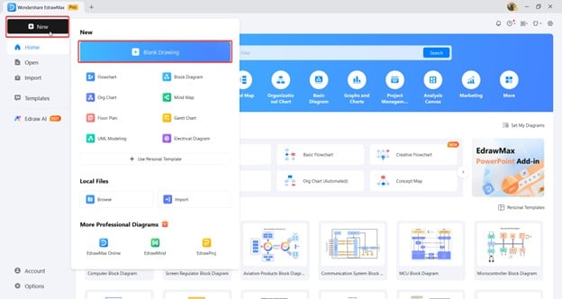
Step1
- Go to New > Blank Drawing from the homepage.
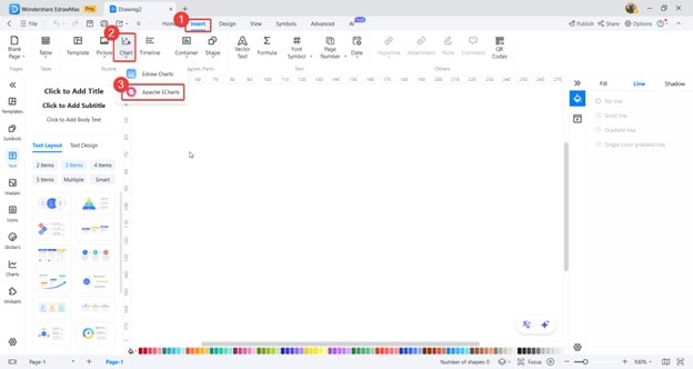
Step2
- Then, go to Insert > Chart > Apache ECharts.
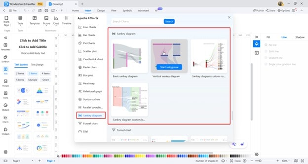
Step3
- Under the Sankey diagram tab, choose a template you want to use.
Step4
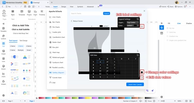
You'll have to edit the Sankey diagram from this page.
- First, you can edit the resource type using the edit label settings button, as marked below.
- You can also edit data values to input the data you want to represent.
- Lastly, you can change color settings if you want a different appearance for your Sankey diagram.
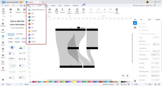
Step5
Export your diagram into your desired file format.
EdrawMax: A Beginner-Friendly, Pro-Level Tool for Sankey Diagrams
Liked what you saw in the previous section? Wondershare EdrawMax brings that intuitive diagramming power to you. This tool supports more than 280 diagrams, including Sankey diagrams. More than that, you can enjoy templates and professional-level tools to make flowcharts, mind maps, floor plans, and more.
Even if you're a complete beginner, you can enjoy using Wondershare EdrawMax for your purposes. Since it has a built-in way to make Sankey diagrams, you don't have to size and re-size elements to properly represent your data manually.


To be more specific, here are some of the key features that EdrawMax has to offer:
- Extensive template library. EdrawMax provides hundreds of pre-built templates, including Sankey diagrams, so you can start quickly without building from scratch. For instance, you could pick a budget flow template and adapt it for a financial report.
- Drag-and-drop interface. You can easily place and connect elements using a simple drag-and-drop workflow. This makes it ideal for beginners who must create a sales funnel diagram on a deadline.
- Massive icon and shape library. EdrawMax includes thousands of icons and shapes to add context and clarity. You might use industry-specific icons when creating a manufacturing process flow.
- Accurate proportional scaling. Sankey mode automatically adjusts link widths based on your data values. This ensures viewers can easily see which channel drives the most visits when visualizing website traffic sources.
- Multi-format export options. Completed diagrams can be saved as PNG, PDF, Word, PowerPoint, or even editable project files. This is convenient when you must include your diagram in a company-wide presentation.
- Cross-platform access. EdrawMax works on Windows, Mac, and Linux and has an online version, allowing you to work from any device. You could start a diagram at the office and finish it at home without missing progress.
Why Choose EdrawMax?
When creating a Sankey diagram, accurate proportions are essential. EdrawMax's Sankey mode automatically scales each flow's width based on the values you input. The software also reduces clutter by intelligently routing links and spacing nodes. Real-time previews simplify experimenting with different layouts and styles without losing your work.
EdrawMax is flexible enough for professionals yet approachable for beginners. You won't waste time wrestling with alignment or recalculating proportions because the tool handles it for you. Once your diagram is complete, you can export it in multiple formats, such as PNG, PDF, or editable project files.
Bonus: Common Mistakes To Avoid When Making a Sankey Diagram
Here are some common mistakes that beginners in Sankey diagramming commit. Don't worry, there's no wrong way to diagram (so long as it works for your team), but here are some general rules of thumb you can follow as you learn the art. After all, a diagram is also meant to be consumed by other people.
While these are tailor-fitted for Sankey diagrams, you can apply them to flowcharts or similar diagrams. Here they are:
- Overloading the diagram. Including every minor stage or data point can make the diagram overwhelming. Group smaller items together or focus only on the key stages. For example, when showing energy consumption, combine minor appliances into one category instead of listing each separately.
- Using inconsistent flow directions. Flows should consistently move in the same direction (e.g., left to right or top to bottom). Mixing directions forces viewers to reorient themselves, making the diagram harder to follow constantly.
- Using similar colors for every flow. If all the links look the same, readers will struggle to distinguish them. Use contrasting colors to highlight different categories or data sources.
- Forgetting to scale the flow widths proportionally. Link widths must match their data values. If scaling is off, the diagram becomes misleading. Always double-check your data before finalizing the diagram.
- Forgetting to label nodes or flow links. Labels help readers understand exactly what each node and link represents. Place labels close to the relevant paths and keep the text concise for easy scanning.
Conclusion
Wrapping up, learning how to make Sankey diagrams is a crucial skill, especially in fields like energy or finance. Even marketing companies enjoy using these tools, which are almost an essential project element. If you're finding yourself in the same spot, then master the knowledge and tips provided earlier in this article.
Of course, you should also learn how to maximize the tools available to make Sankey diagrams, like Wondershare EdrawMax. As you've seen, it's easy to make different kinds of diagrams and personalize them to your team's or your personal needs. Try it out today and see the change it can make in your workflow.
